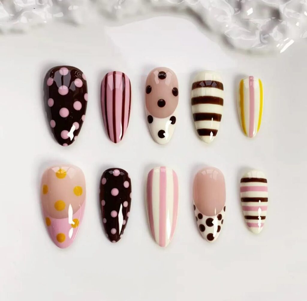
Stripes and dots are the oldest trick in nail art and they still work, which is a slightly annoying thing to admit when you have spent years learning harder techniques. This post is about the two candy-coloured sets we build most often, one gingham and one pastel, and how to choose between them.
Before you read on
As an Amazon Associate I earn from qualifying purchases. Retailer links in this article are affiliate links and cost you nothing extra. We only link to tools we use or would genuinely buy. Full wording on our affiliate disclosure page.
The oldest trick that still works
Every few seasons a new nail trend arrives with a name and a hashtag, and every time we look at it we find a stripe or a dot hiding inside. Stripes and dots have survived because they are almost impossible to get wrong in a way that matters. A stripe that is a hair too wide still reads as a stripe. A dot that is slightly off-centre still reads as intentional, especially if the other dots agree with it.
The other reason we keep coming back to them is that they photograph beautifully without any special light. A glossy stripe catches a highlight along its length, and that highlight does half the styling work for you. A plain colour has to earn its own shine; a striped nail comes with a built-in glint.
Set one: the candy stripes
The first set is the one in the hero image: an almond base in chocolate, pink and cream, worked into vertical stripes, polka dots and a few soft French tips so the hand never gets repetitive.
Two things make this set read well. The first is that the stripes run vertically. Vertical stripes lengthen the nail, and on a naturally round nail bed that is worth more than any amount of careful shaping. We tried a horizontal version of the same palette once and it made even long nails look stubby, so vertical is now a studio rule, not a preference.
The second is the colour order. We paint the stripes in order of tone, dark, light, mid, so the eye travels down the nail rather than snagging on two similar tones placed side by side. When you are mixing a striped palette of your own, lay the bottles out in a row and squint at them. If two neighbours blur together when you squint, swap one.
Set two: the pastel swirls
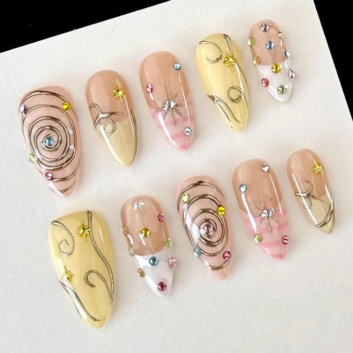
The second set moves from stripes to gold metal. A pastel yellow and pink base, then a swirl in gold gel drawn as one continuous line that loops across the nail, plus a scattering of tiny star charms and two or three small gems placed deliberately rather than randomly.
Gold metal swirls are unforgiving in a way that stripes are not, because a metallic line shows every wobble. The fix is not to draw more slowly, it is to load the brush properly and commit. A liner brush with enough gold gel on it glides; one that is nearly dry drags and shudders. We load, then wipe one side, then draw the swirl in a single motion and stop. Redrawing a gold swirl doubles the thickness at the overlap and it reads as a mistake every time.
Gem placement is the other half. The mistake people make is spreading gems evenly across the whole set, which looks like a craft kit. We cluster instead: three tiny gems on one nail near the cuticle, a single star on the nail beside it, and nothing on the next. That uneven rhythm is what makes it look styled rather than sprinkled.
Studio pick
Striping tape. If you have never painted a straight line you like, stop trying and start taping. Press a strip of thin striping tape across the nail, paint over it, and pull it away while the polish is still wet. The edge you get is sharper than any freehand brush, and it turns a fiddly design into something you can finish in one sitting. Keep a roll in the drawer even once you can freehand, because it still wins on the hard angles.
Which one for your hand
Our general advice is to pick by nail length and by where you want the attention.
- Short or round nails: the candy stripes, always. The vertical lines create length that is not really there, and the dots keep the set from feeling too busy on a small surface.
- Almond or oval nails: either set works, but the pastel swirls look especially good here because the curve of the swirl echoes the curve of the shape.
- Square or coffin nails: the pastel set, with its star charms, has enough structure to hold a squared silhouette without looking cluttered.
- Weekend versus workday: if you need something for the office, the candy stripes in a soft palette pass as considered rather than fun. The swirl set with gems is dinner, not desk.
If neither feels right, it is usually because you want the set to do less rather than more. The third option in this family is a plain nude with one accent, and we wrote about a few of those in our guide to quiet sets for the work week. Sometimes candy is the wrong answer and that is fine. And if you want the playfulness of this set pushed further, past pattern and toward actual characters, the cartoon fruit set is our most literal version of fun.
Studio pick
A pastel gel polish set. The candy palette lives or dies on the quality of the pastels. Cheap pastels are streaky, and a streaky stripe cannot be saved by a good top coat. A set of pastel gels in matching formula means the pink and the yellow behave the same way on the brush, so the stripes look like they belong to the same family instead of two different brands arguing.
Getting a stripe the width you planned
The gap between a stripe that looks finished and one that looks homemade is almost never the colour. It is the width. The easy way to control it is to decide the width before you load the brush and then draw the line in a single pass, because a second pass almost always lands a fraction off the first, doubling the line at one end and giving away that it was freehand.
If you are working without tape, rest your little finger against the finger you are painting. That contact point steadies the whole hand, and it is the reason a good nail artist can draw a straight line on a curved surface at all. If a line does go wrong, resist the urge to fix it while it is wet. Let it cure, wipe it back with a clean brush and a little alcohol, and start again. Chasing a wet line is how a small mistake turns into a smear.
The dot, done properly
One last note on dots, because we see the same three problems over and over. Dots that grow as you work happen because the polish thickens on the tool between placements, so wipe it every time. Dots that look flat happen because they were applied with too little polish, so the dot has no dome. And dots that look accidental happen because they were placed without a line to follow. Pick a mental line, the cuticle curve or the side wall, and place the dots along it. Even spacing along a clear line is ninety percent of what makes dots look deliberate.
Stripes and dots are not beginner work that you graduate away from. They are the grammar of nail art, and the people whose work we admire most are usually the ones who still paint the cleanest stripe in the room.