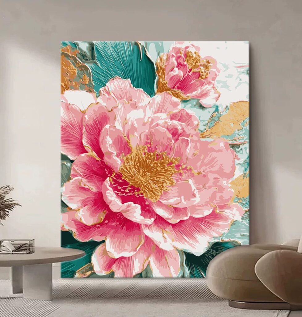
If someone has never finished a paint-by-numbers kit and they want to try a flower, this is the one we hand them. Peonies are big, loose, and forgiving in a way that roses and orchids are not, and this kit proves it from the first region to the last.
Before you read on
As an Amazon Associate I earn from qualifying purchases. Retailer links in this article are affiliate links and cost you nothing extra. We only link to tools we use or would genuinely buy. Full wording on our affiliate disclosure page.
Why a peony is the best first flower kit
Flowers are the natural first subject for a kit painter, but they are not all equally kind. A rose has tight, fiddly curls and a lot of small regions. An orchid has thin, unforgiving shapes that show every wobble. A peony, by contrast, is built from big soft petals with broad, curving edges, and the colour inside each petal shifts gently rather than jumping around.
That combination of size and softness is what makes this kit a genuinely good place to start. The regions are large enough that you can fill them with a comfortable brush. The edges between petals are curved and generous, so a slightly imprecise line of paint still reads correctly. And because petals overlap in natural layers, the eye is used to seeing soft transitions here, which means small imperfections disappear into the flower rather than standing out against it.
We have handed this kit to two people who had never painted anything since school and both finished it. That is not something we can say about the denser kits on our shelf.
The close-up lesson: thick paint makes the numbers vanish
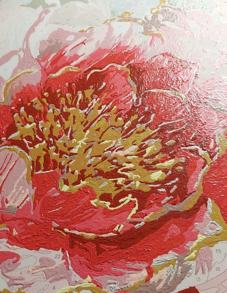
Here is the thing the close-up photo really shows, and it is worth understanding before you start. Kits print a faint number inside every region, and they also print the fine lines that divide one region from the next. In the beginning those numbers are your whole map. By the end they are supposed to be gone.
They disappear because the paint is applied thickly enough to bury them. If you paint a region with a single thin, watery coat, the number ghosts through and you can still see the printed outlines at the edges. If you load the brush and lay the colour down properly, the number and the boundary line both vanish under it. The close-up in these photos is taken at the very end, at the corners of the canvas, and you can still make out a few unnumbered edges where the printed line has not yet been covered.
We like that this photo exists, because it is an honest record of how the kit actually looks while you work. It also gives you a useful test: if your numbers are still reading strongly after two coats, you are painting too thin. One confident, loaded coat beats two timid ones every time, and it takes less effort.
Working from the dark centre outward
For the flower itself, we painted from the centre outward. The peony’s middle, where the petals bunch and fold, is the darkest area of the bloom: deep rose, almost berry in places. The outer petals are the lightest: soft pinks, a little cream at the very rim.
Painting the dark centre first has a practical benefit that took us a while to appreciate. Once the strongest, darkest colour is on the canvas, every lighter pink has something to be measured against. You can see immediately whether a mid-tone is light enough or whether it is going to sit too close to the centre. If you paint light-to-dark instead, you spend the whole session guessing and correcting.
It also helps the flower feel like it has depth. A peony reads as a peony because it seems to open toward you, and that effect comes from the gradient running darkest at the core to lightest at the rim. Paint that gradient in the right direction and the whole thing works.
The three-pinks rule
The whole flower runs on three pinks, and every region on the canvas is a variation of one of them:
- One light pink. The broad, open outer petals. Airy, slightly creamy, the colour that fills most of the canvas and keeps the whole thing from feeling heavy.
- One mid pink. The bulk of the blooms and the transition between the bright rims and the deep centre. This is the workhorse colour.
- One shadow pink. The core of the flower and the cracks between petals. Deep, slightly cool, and used the least.
What we learned by sticking to this rule is that you do not need twenty pinks to make a convincing flower. You need three, used in the right places. The kit supplies a few more, and once or twice we blended a neighbour in where the canopy of petals needed a bridge, but the structure stayed three-pink throughout. Keeping it that simple is why the finished flower feels calm rather than fussy.
How long it actually took
Honestly, around eleven hours, spread over five or six evenings. The first session, filling the big outer petals, went quickly and was genuinely relaxing. The middle sessions, working through the layered pinks, were the bulk of the time. The final pass, tidying the edges between petals and going back over anything that still showed a number, took a whole evening on its own.
That last tidying session is the one people skip, and it is the one that decides how the canvas looks on the wall. It is not glamorous. It is just going around the whole flower, region by region, checking that no printed line or number is still peeking out, and touching in a thicker stroke where it is. Half an hour of that is worth more than another hour of detail anywhere else.
Getting the paint to behave
Two small things made this kit easier. The first was keeping the paint open long enough to work with. Acrylic dries fast, and on a warm afternoon a pot can skin over in the time it takes to finish one petal edge. A drop of retarder keeps it workable for longer, which matters on a kit where you are blending within a region rather than just filling it.
The second was varnishing at the end, and we will repeat this on every kit we write about because it makes such a difference. Before varnish the pinks looked slightly dusty and the whole flower sat flat against the beige wall. After varnish the colour deepened, the petals looked almost juicy, and the canvas stopped looking like a craft project and started looking like a painting. If you take one habit away from this post, take that one.
Hanging and framing the finished peony
Against the beige wall in the photo, the pink has just enough warmth to lift the space without shouting. That is the sort of wall a peony likes: a soft neutral with a little warmth, nothing that competes with the colour. If your walls are a cooler grey, the pinks will read cooler too, so a warm-white frame is worth considering to bring some of that warmth back.
We hung ours without a frame. The canvas has clean painted edges and the flower reaches close to them, so a frame would only crowd it. If you do frame it, go slim and simple, in a tone close to the walls, and let the peony be the only thing in the room with real colour. Keep it out of direct sun, as with any kit, and it will hold its brightness for years rather than months.
The other thing a peony does well is travel. Of all the kits we have given away, this is the one people actually finish. It makes a kind first gift for someone who is sure they are not artistic, because the flower carries the work and the painter only has to show up.
What stays on the bench
Studio pick
Acrylic retarder. A few drops stirred into a pot keeps the paint blendable long enough to work a petal properly instead of fighting a drying edge. It is the difference between soft gradients and visible brush lines.
Studio pick
A good brush-on varnish. Water-based satin or gloss, applied thin and even after the paint is fully dry. It deepens the pinks, evens out the sheen and protects the finished canvas from dust and light.
The short version
Start with a peony. Big petals, soft edges, three pinks, and a flower that forgives a beginner. Paint the dark centre first, fill boldly enough that the numbers disappear, then spend a final pass making sure none of them are still showing. Retarder helps the blending and varnish finishes the job. Eleven honest hours, and you have a painting that looks like it took far longer.
Once you are comfortable with a flower, the natural next step is a face, and the face is a bigger jump than it sounds. Our account of the koi underwater portrait explains exactly where that jump gets hard. And if you prefer flowers but want them in the hardest palette of all, the white impasto floral is what happens when a beginner’s flower grows up and loses all its colour.