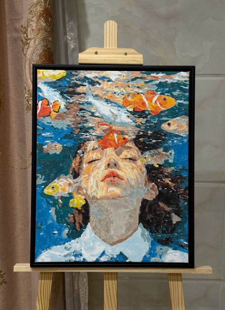
We bought this kit for the wrong reason. Koi and a face, together, in one canvas. It looked like the sort of thing that would embarrass us if we got it wrong, which is exactly the sort of thing we tend to learn the most from. It took more than thirty hours across three weeks.
Before you read on
As an Amazon Associate I earn from qualifying purchases. Retailer links in this article are affiliate links and cost you nothing extra. We only link to tools we use or would genuinely buy. Full wording on our affiliate disclosure page.
Why we picked a kit that scared us
Paint by numbers has a reputation as a gentle hobby, and for most kits that is fair. Large regions, a forgiving palette, a finished picture that looks fine from across the room. This one was not that. It had a woman’s face half submerged in water, and two koi swimming past her shoulder, and the whole thing was painted in blues so close together that the numbers on the canvas were the only thing telling you which pot to open.
The koi were the draw and the face was the worry. Faces are where kits fall apart. Get the skin sections slightly wrong and a serene underwater portrait turns into a mask floating in a pond. We wanted to know whether a kit could carry a face, and whether we could follow it closely enough to find out.
Thirty hours, three weeks, and no rush
The honest number is thirty-something hours. We stopped counting precisely somewhere in the second week. Put it across three weeks in evenings, mostly an hour or two at a time, a long weekend session near the end to finish the fish.
We have learned to treat that as information rather than a complaint. Kits like this reward short sessions. The detail is dense enough that after ninety minutes your eye stops seeing the difference between two neighbouring blues, and that is when mistakes happen. An hour, a break, another hour is faster overall than a five-hour grind, because in the grind you end up going back to fix things.
It is worth being straight about the size of the commitment before you buy a kit like this. If you want something to finish in a weekend, this is not it. If you want something to live inside for a few weeks, one small region at a time, it is genuinely rewarding.
The face sections: paint the skin last
Here is the single trick that saved the face, and it applies to almost any portrait kit. Do the skin last.
It is tempting to start with the face because it is the part everyone looks at. Do not. Paint the water, the hair, the clothing, everything around the face first. Two things happen when you do. First, by the time you reach the skin you have warmed up and your hand is steady. Second, and more usefully, you can see the face emerging from a finished surround instead of guessing at a head sitting on blank canvas. You judge skin tones against real neighbouring colour rather than against white, and skin tones read completely differently on white. A shade that looks right in isolation turns out too pink once the cool blues are in next to it.
We also went lighter on the skin than the numbers first suggested. Kit skin tones are often a little too saturated, and a slightly paler mix reads more like a face underwater, where light scatters and everything softens. That was the one place we deliberately departed from the printed numbers.
Laying the water before the fish
The water is nine-tenths of this canvas, so it sets the whole mood. We painted the blues in order, from the top of the canvas down, moving from the lighter regions into the darker ones and never going back. This matters because in a blue-dominant painting the value relationships are doing all the work. If you jump around, you lose track of which blue is meant to be deeper than which, and the surface goes flat.
Working in bands also lets the paint set slightly as you go, so you can see the gradient building. Every so often we stood back and squinted, which blurs the detail and shows you only the light and dark. Squinting is the cheapest quality check there is, and it caught a couple of regions where we had drifted a shade too dark.
Then the koi went in. They are the reason the palette is mostly muted. When almost everything on the canvas is a soft blue or a shadow, two flashes of orange do not need to be bright at all. They simply read as bright because they are the only warm thing in the picture. If we had made the blues more colourful, the fish would have disappeared into them. Restraint in the water is what makes the koi pop.
What the varnish did
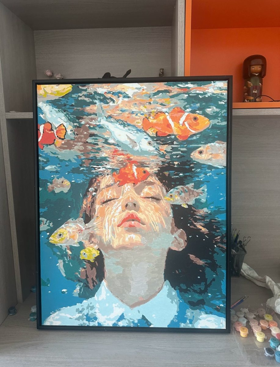
Acrylic dries matte and slightly chalky, and when we first stepped back from the finished canvas the whole thing looked a little dusty. That is normal and it is mildly alarming every time. The blues in particular seemed to have sunk into the fabric and gone quiet.
Varnish brought them straight back. A thin, even coat, brushed in one direction, deepened every dark and made the water look wet rather than flat. It also evened out the small differences in sheen between thick and thin areas, so the canvas stops looking patchy. The orange of the koi gained the most: it went from flat poster paint to something with a little glow.
Two things we would tell anyone varnishing their first kit. Make sure the paint is completely dry, a good few days, or you will smear it. And use two thin coats rather than one thick one, because a heavy coat can pool and stay tacky for days. The difference between an unvarnished and a varnished kit is the difference between a craft project and a painting.
The mistakes we made along the way
We are not going to pretend the run was clean. Twice we caught ourselves painting a region a shade too dark and had to let it dry and come back with a lighter mix over the top. Both times it happened late in an evening session, which is the pattern we warned about earlier. The fix was not clever. It was stopping for the night and starting fresh.
The other mistake cost more time. Early on we worked left to right across the canvas instead of finishing the water in value order, and by the second session the blues on the left had drifted slightly away from the blues on the right. It is barely visible now, especially under varnish, but we know where to look. Next time we would paint the water in bands from the top down, the way the kit implies, and not skip around.
One more small thing. We nearly ran out of the pale blue because we over-applied it early on the largest water regions. Kits rarely include much spare, so it pays to be a little careful with the pot you use most, at least until the biggest areas are covered.
Framing and hanging a finished kit
A finished kit paints thinner than a hand-painted canvas, and the edges are usually blank board, so a simple frame does a lot of quiet work. We used a plain, narrow frame in a warm neutral. Anything ornate fought the water. If your canvas has clean painted edges, hang it bare and skip the frame altogether.
Keep it out of direct sunlight, because kit acrylics are not always lightfast and the blues are the colours most likely to shift over a few years. Dust it with a dry, soft brush rather than a cloth. The surface is smoother than an oil impasto, but kit paint can still lift where it was applied thinly, and a brush is gentler than anything with a nap.
What stays on the bench
Studio pick
A fine detail brush set. A kit with a face lives or dies on the smallest brush in the set. The one in the box was too thick for the eyes and the little koi fins, so we swapped in our own fine rounds and the whole detail stage got easier.
Studio pick
A table easel. Propping a canvas on the table makes you work at an awkward angle and your neck pays for it. A small table easel tilts the canvas toward you and lets you step back to check the water, which is most of what this painting is.
Would we do it again
Yes, and we are already looking at the next one. The face came out better than we feared, mostly because the kit pre-shades it and because we had the patience to leave the skin until last. The koi are the part guests notice first, which is exactly what the muted blues were for.
If this is your first kit, do not start here. Start with something with bigger regions and a friendlier palette, and read our honest beginner’s review of the underwater blues kit, which is the one we hand to first-timers. When you are ready for a face, a flower is the gentler step up, and the pink peony kit teaches the same patience with far less risk.