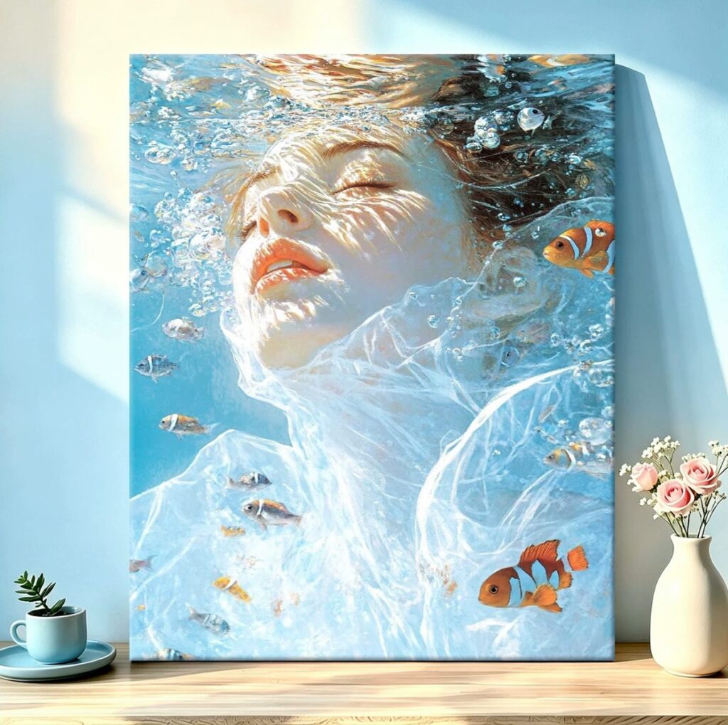
This is the kit we recommend to anyone who has never finished a paint-by-numbers canvas before. It is the one we hand to friends, the one we suggest when someone says they are not artistic, and the one that surprises nearly everybody who finishes it.
Before you read on
As an Amazon Associate I earn from qualifying purchases. Retailer links in this article are affiliate links and cost you nothing extra. We only link to tools we use or would genuinely buy. Full wording on our affiliate disclosure page.
What makes a good beginner kit
The phrase “beginner kit” gets used loosely, so here is what actually separates a kind kit from a cruel one. Two things matter most: the size of the printed regions, and how much the palette punishes a wobbly hand.
This underwater portrait gets both right. The regions are large and orderly, especially through the water around the figure, so you can fill them with a comfortable brush and a couple of confident strokes. And the palette is forgiving in the specific sense that its colours sit close to each other. When neighbouring regions are similar blues, a slightly sloppy edge simply blends into the colour beside it. On a canvas with high contrast, the same sloppy edge would show up as a hard mistake.
So the kit is forgiving where a beginner needs forgiveness and structured where they need a map. That combination is why it works as a first finish, and why we keep a couple of them in the studio for exactly this purpose.
The blues-only discipline
Eleven pots, and almost all of them are blue. Pale blue, sky blue, grey-blue, deep blue, a couple of almost-white tints and one or two far darker darks. First-time painters sometimes look at that and feel cheated, as though the kit forgot to include real colours.
We think the opposite. For learning, a single-hue palette is a feature, not a limitation. When every colour is a version of blue, the only thing separating them is value, meaning how light or dark each one is. That forces you to pay attention to value in a way a rainbow palette never does.
Value is the single most important skill in representational painting. Get the values right and the picture reads correctly even if the colours are slightly off. Get them wrong and no amount of lovely colour will save it. A canvas that makes you spend eleven pots thinking only about light and dark is quietly teaching you the thing that matters most, and you barely notice you are being taught. If you ever later pick up a brush to paint something of your own, that instinct will still be with you.
The face was easier than expected
This is the part we expected to be hard, and it turned out to be one of the more satisfying stages. The reason is that the kit pre-shades the face for you.
Because the canvas already maps out where the shadows fall on the face, under the jaw, beside the nose, around the eyes, you are not trying to invent an expression. You are filling in a plan that a designer worked out in advance, and the printed numbers are far closer together across the face than anywhere else on the canvas. That density means each region is small and specific, and the shading accumulates almost by itself.
Our advice is simply to slow down here. Use your smallest brush, fill each region cleanly, and resist the urge to blend across the printed lines. The kit has already decided how the face works. Your job is to be accurate, not creative, and there is something oddly relaxing about that. We ended up enjoying the face more than the water.
The ripples on the collar
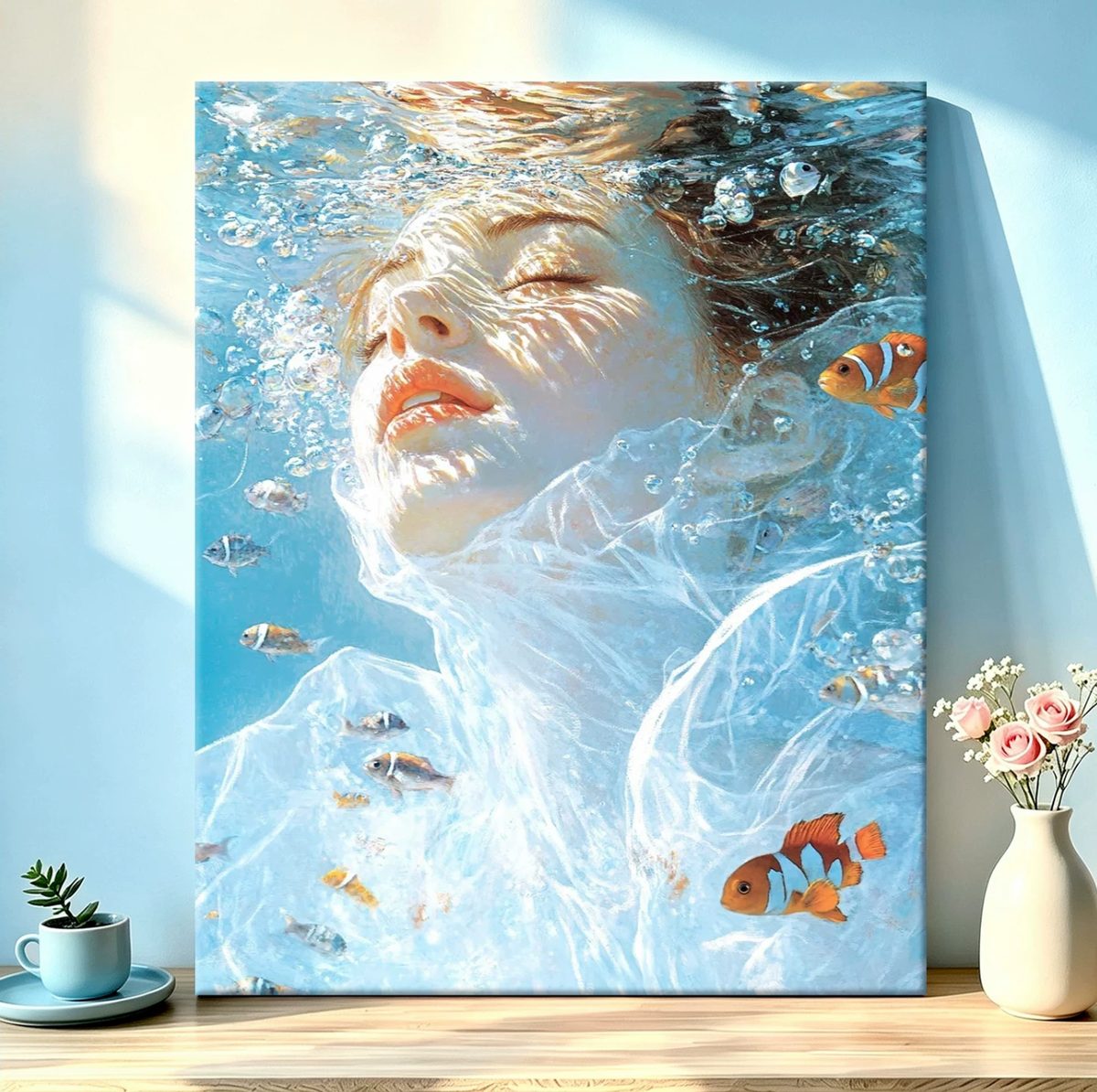
Every person who has seen this canvas in person asks about one thing: the light ripples flickering across the collar and the edge of the shoulder. It looks like a clever trick, the sort of thing you would need real skill to paint.
It is not. Those ripples are already mapped on the canvas, and they are just a series of small, wavy regions alternating between a bright pale blue and a slightly darker one. What makes them work is contrast and where they sit, not any special technique. Once you understand that they are simply alternating light and dark shapes following the contour of the clothing, the mystery evaporates.
The one tip we would give for the ripples is to keep the brights truly bright. It is tempting to tone them down so they feel less bold, but the whole watery effect comes from those regions staying clean and light against the darker blue. Toning them down turns shimmering water into a flat stripe.
Where we hung it
The canvas in the photo hangs against a duck-egg wall, and that was deliberate rather than accidental. Pale blue paintings are notoriously fussy about their surroundings. Against a warm cream they can look cold and disconnected, and against a strong colour they fight for attention.
A soft, muted blue wall does something different. It makes the painting feel like it belongs, as though the water is leaking gently out of the frame. The trick to hanging a blue canvas is to let the wall echo it rather than contrast with it. If your walls are warm, add a plain off-white mount or a light wood frame to give the blue a little breathing space before it meets the wall.
It suits a place where you actually sit and look at it too, so this one lives where there is a chair and good light. A quietly detailed painting like this rewards a second glance more than a bold one does, and its best spot is somewhere that gets one.
How long it took, and how to pace it
Around nine hours across four evenings, which is a genuinely short kit by paint-by-numbers standards. The first session was almost entirely the background water, and it went fast because the regions are large and the colours sit close together, so accuracy was not demanding. The face took one focused evening. The ripples and the final tidy-up took the last one.
Four evenings is also a good pace for a first kit. Long enough that you feel the project build, short enough that you do not lose interest halfway through. If you only have half an hour a night, it will stretch out in wall-clock time, but the region sizes mean you can still finish something meaningful in each short session, which is what keeps the momentum going.
What we would change next time
Honestly, very little, which is unusual for us. The one thing we would do differently is start with the darker blues rather than the palest. Beginning with the light tints covers the most area and feels productive, but it makes the light and dark relationship harder to judge early on. Working outward from the darkest regions would have kept the values anchored from the start.
We would also keep a little retarder or a colourless blender to hand for the face, purely because the skin transitions are fine enough that keeping the paint open for a few extra minutes helps. For the water it was not needed at all.
One note on framing, since people ask. Because this canvas reads as a picture rather than as a texture, it frames well. A simple pale wood frame with a narrow profile suits the soft blues and helps them stand apart from a coloured wall. Ours is unframed against the duck-egg wall, but that was a choice about the room, not about the painting.
What stays on the bench
Studio pick
A blue acrylic paint set. The pots that come with a kit can run thin by the last few regions, and having a decent set of blues on hand lets you top up or mix a near-match instead of stretching a failing pot.
Studio pick
Brush soap. Acrylic dries hard inside a brush and ruins the point, which is death for a small detail brush. A minute with brush soap at the end of each session keeps them working for years instead of weeks.
The honest verdict
As a first kit, this is about as kind as they come. Large regions, a calm and forgiving palette, and a face the kit has already worked out for you. It teaches value control without ever announcing that it is teaching you anything, and it finishes into something you would genuinely hang rather than tuck away.
If you want a step up once you have this one under your belt, the greens are the next challenge, and our write-up of the village kit and its hundred shades of green will tell you honestly why it is not the place to start. And if you like the underwater mood but want more of a test, the koi portrait runs on the same blues and adds two fish and a much harder face on top.