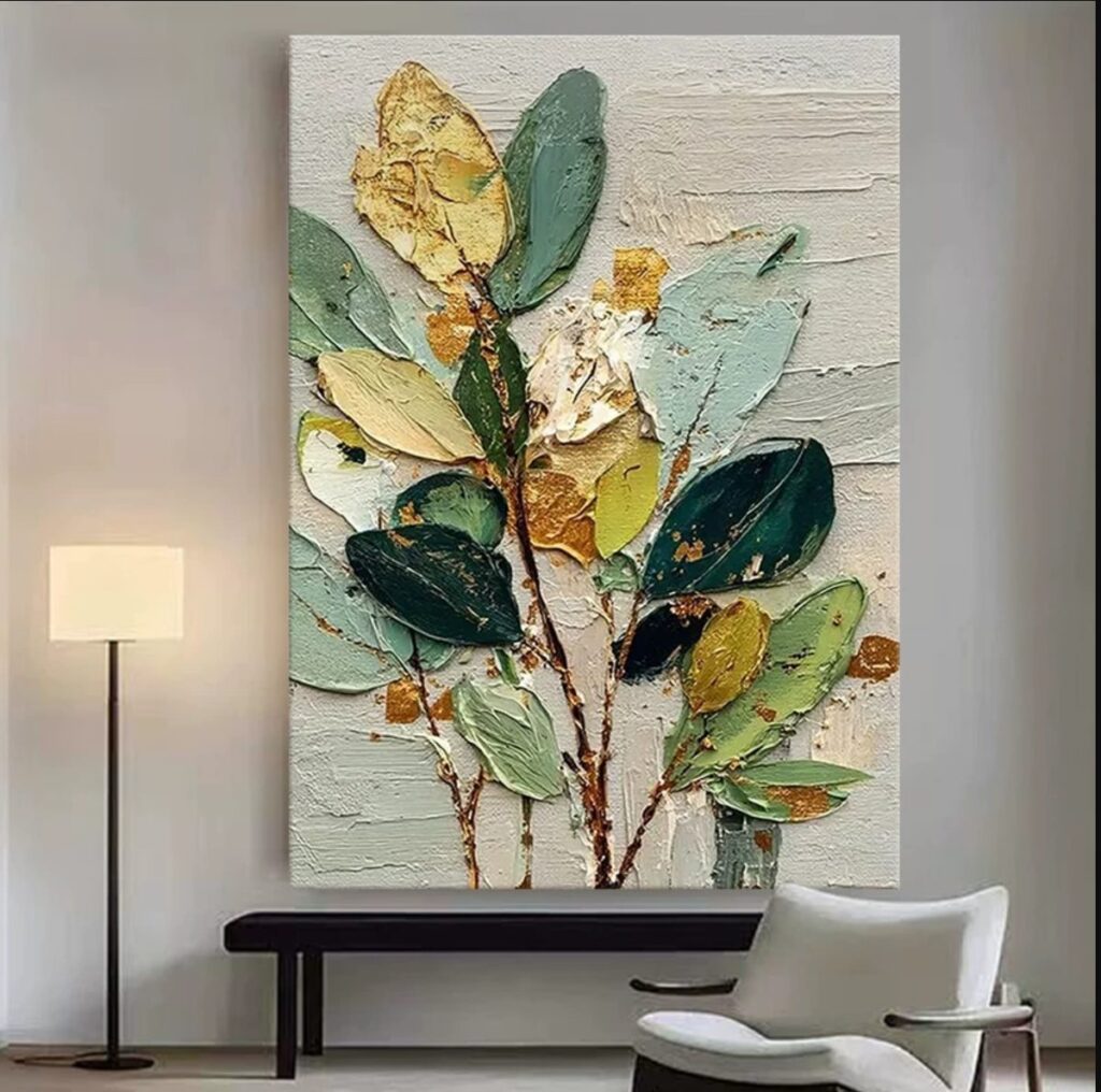
Every few weeks someone asks us to paint something for a wall they do not quite trust. A hallway. A sideboard. The strip of wall beside a door that only ever holds a coat hook. Our answer is nearly always the same one: a botanical abstract, sage and cream, with a little gold worked through the leaves.
Before you read on
As an Amazon Associate I earn from qualifying purchases. Retailer links in this article are affiliate links and cost you nothing extra. We only link to tools we use or would genuinely buy. Full wording on our affiliate disclosure page.
Why a botanical flatters almost any wall
Botanical abstracts are the most forgiving paintings we make. They are not portraits, so nobody is checking a likeness. They are not landscapes, so nobody is asking which mountain that is. What they do instead is quiet, useful work: they bring colour and surface into a space that has neither, and they do it without demanding a theme.
Think about what usually goes wrong when a painting does not suit a room. It is nearly always specificity. A bright beach scene fights a dark leather sofa. A very graphic black-and-white print makes a warm room feel cold. A botanical has no such argument to pick. Leaves read as decoration, not as a subject, and that is why the same canvas can sit above a hallway bench and later move to a dining room and look just as settled in both.
There is a practical side too. Green, sage and cream are the colours already hiding in most homes: in the wood, in the stone, in the plants on the windowsill. If a painting is built from colours the room already contains, it will look chosen rather than dropped in.
The palette, and why it stays tight
We keep this palette deliberately small. Sage green as the base, forest green for the deepest leaves and stems, ochre for warmth, a great deal of cream, and then the gold. Four working colours plus a metal. That is the whole recipe.
The reason is that a botanical only looks expensive when the greens agree with each other. Add a bright emerald and the whole thing turns cheap. Add a purple and it turns decorative in a way we do not want. So we mix sage and forest on the palette until they sit at the same temperature, and the ochre only ever appears as a fleck, a stem, a rubbed edge, never as a block.
The cream does more than people expect. On a large canvas, cream is what keeps the greens from feeling heavy. It is the space between the leaves. When a customer says a green painting felt dark in their room, it is almost always because there was not enough of this lighter ground showing through.
Building petals with a palette knife
This is where the painting stops being a picture and starts being an object. We do not brush the petals. We load a knife and press the paint down in single strokes, then leave those strokes alone. Each petal is two or three presses at most. Overworking with a knife is the fastest way to turn a crisp petal into grey mud.
Thick paint is the point. The impasto ridges catch the light from the side, so the painting changes as you walk past it, which is exactly what you want on a hallway wall. A flat painting on a hallway wall does almost nothing. A knife-painted one throws small shadows.
Then we scratch the stems. Once the paint has firmed up for a few minutes, the back of a brush handle, dragged through the wet surface, cuts a thin line that reads as a stem or a vein. It is a two-second gesture and it looks completely intentional. Scratched stems also give the eye something thin and sharp to follow through all that soft, thick colour.
How gold leaf behaves over dry acrylic
Gold leaf is the part people find mysterious, so here is the honest version. The acrylic has to be fully dry first, and we mean dry, not nearly dry. Leaf laid onto paint that is still moving will wrinkle with it and lift at the edges within a day.
On dry acrylic we brush a size, a thin adhesive, exactly where the gold should land. It goes tacky in about ten to fifteen minutes depending on the room. We then lay the leaf with a soft brush or a piece of wax paper and press it down gently. Gold leaf is thinner than a breath and it will follow every ridge of the impasto, which is precisely the effect we want. It settles over the high points of the petals and leaves the valleys in shadow, so the metal looks like it grew there rather than being stuck on.
The trick is to seal it. Bare gold leaf will tarnish and dust off over years. A thin coat of acrylic varnish brushed over the top locks it down and keeps its shine, and it also lets you buff the duller, stray flecks into something softer. We use the flakes and offcuts rather than full sheets for the flecks you see scattered across the canvas. Waste gold is the best gold.
If you want to see how a completely different surface is built, our piece on the white impasto floral uses the same knife logic but has nowhere to hide. It is worth reading after this one, because the two sit on the same shelf in the studio.
Choosing the size for the wall
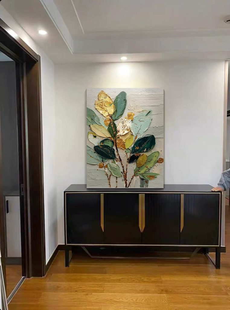
The two rooms in these photos show the size decision we get asked about most. The first canvas, above the bench and the lamp, is the larger of the two. The second, on the sideboard, is smaller. Both work, but for different reasons.
- Above a bench or a console: leave at least a hand’s width either side of the canvas and a good gap above the seat or surface. A painting that nearly touches the bench looks squeezed. Slightly wider than the piece of furniture below it is the safest proportion.
- Above a sideboard: one canvas, centred, reads calm. Two smaller ones side by side reads collected. Mixing a large and a small reads accidental.
- A narrow hallway: go taller rather than wider. Long, low canvases fight the perspective of a corridor, while a portrait-shaped piece pulls the eye up the wall.
- Centre height: the middle of the canvas roughly at eye level. It is the single rule that fixes more bad hangs than any other.
If you are unsure, send us a photo of the wall with something for scale, a lamp or a chair, and we will tell you what we would hang. We would rather talk you down to a smaller canvas than have you buy one that crowds the space.
Living with a textured canvas
A knife-painted canvas looks fragile and is tougher than it appears. The ridges of acrylic stay slightly flexible once cured, so a light knock will not crack them the way a heavy oil impasto can. What it does not like is dust settling into the valleys between strokes, where a flat cloth cannot reach. We keep a soft, long-bristled brush for exactly this, and a gentle pass once a month keeps the surface looking the way it did the day it went up.
Keep it out of direct sun. The greens hold well over time, but the gold is the part that ages first, and prolonged bright light dulls it before anything else on the canvas. Sealing the leaf with varnish slows that down a great deal, which is one more reason we finish every piece before it leaves the studio.
If you would rather not paint one yourself, this is one of the pieces we make to order. The green and gold botanicals we sell through our Etsy shop tend to go at slightly different sizes to the two shown here, since most people are fitting a specific wall. Same method either way, adjusted to the space.
What stays on the bench
Studio pick
A proper palette knife set. A stiff, flexible blade is the whole technique. Cheap knives bend at the ferrule and smear instead of lifting, and a set with a few blade shapes lets you press wide petals and fine stems with the same tool family.
Studio pick
Loose gold leaf sheets and a soft leafing brush. Buy the loose sheets rather than the transfer kind, because loose leaf follows the impasto ridges the way we want it to. A soft squirrel brush lets you press it down without tearing it.
The short version
If you want one painting that will still look right after you move the furniture twice, a sage and gold botanical is the safe bet. Keep the palette tight, press the petals in single knife strokes and leave them alone, and seal your gold. Size it a little wider than the furniture below it, and hang the middle at eye level. That is the whole method.
If the muted green and blue palette is more your room, the koi underwater portrait we finished last month runs on the same calm colours in a very different style, and it might suit a cooler wall even better.